What’s New and the Latest Enhancements in Paragon
User Interface Updates
We refined the Contact’s Saved Search pages by removing extra space in the Activity table and an unnecessary scrollbar in the Comments table.
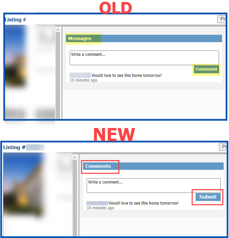
In the Comments dialog box, we changed the pane title from “Messages” to “Comments” and the submission button text from “Comment” to “Submit” to be more uniform and standard.
In the Agent Recommended heading, we’ve changed the word “client” to “contact.”
Price Analysis Widget
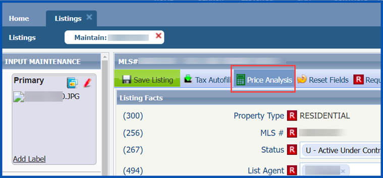
We are very excited to announce the Price Analysis feature, which can help you determine pricing by viewing the Potential Buyers and available Automated Valuation Models (AVMs) when you enable it. You can find this feature through the menu bar of the Listing Input Forms for current Full, Partial, or Subject Property Listings.
Clicking the Price Analysis option will launch an interactive modal displaying the Potential Buyers in CRMLS Paragon.
The Potential Buyers are contacts in Paragon, Paragon Connect, and your Collaboration Center who have saved searches with parameters that your property would qualify for.
The Potential Buyers and the AVMs allow agents to determine how a price change might affect potential buyers by entering a New Price into the widget and clicking on Recalculate Buyers. Clicking the Use New Price button will automatically change the price on the listing input form.
The Price Determiner will be an incredible tool that users can show clients or potential clients to help determine pricing and/or to help motivate to list.
Our plans for future enhancements include a Price Analysis widget called “Location Score,” which will display the relative popularity of the listing, based on postal area, compared to other postal areas.
Collaboration Center – Property Search Moved to Main Tab
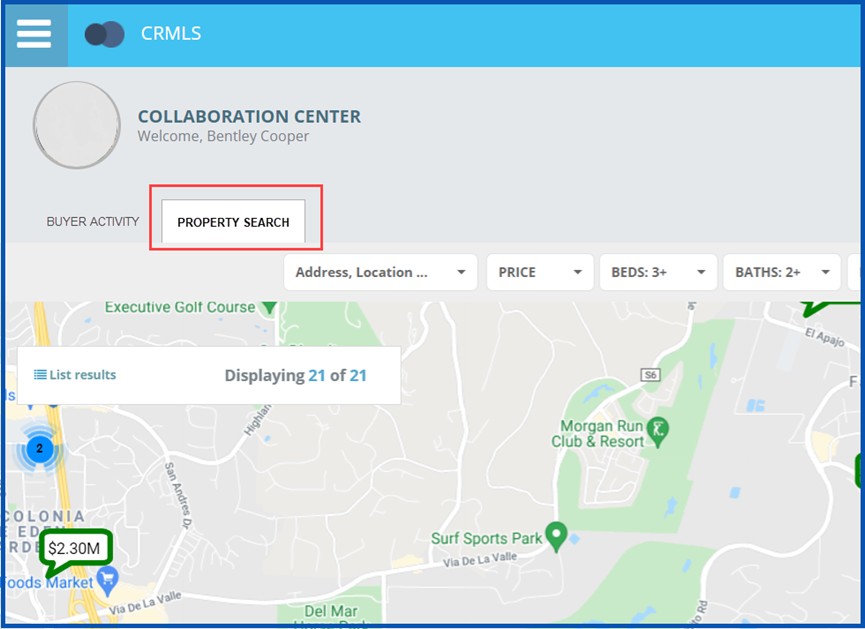
We’ve included a Property Search feature tab on the Collaboration Center dashboard to encourage your clients to take advantage of this feature.
The tab will contain all the same search features as previously, and it will only appear on larger resolution devices (PC’s, tablets). This will not impact the mobile interface.
Paragon Connect
Top App Bar
We’ve added a new top bar in the Paragon Connect application, moving the profile menu and home button into the left navigation. We plan to continue building on the top bar to include navigation (Back and Forward) to help you move easily through the app with your browser’s native buttons.
Contact List
We’ve made several changes to the Contact list to support new features.
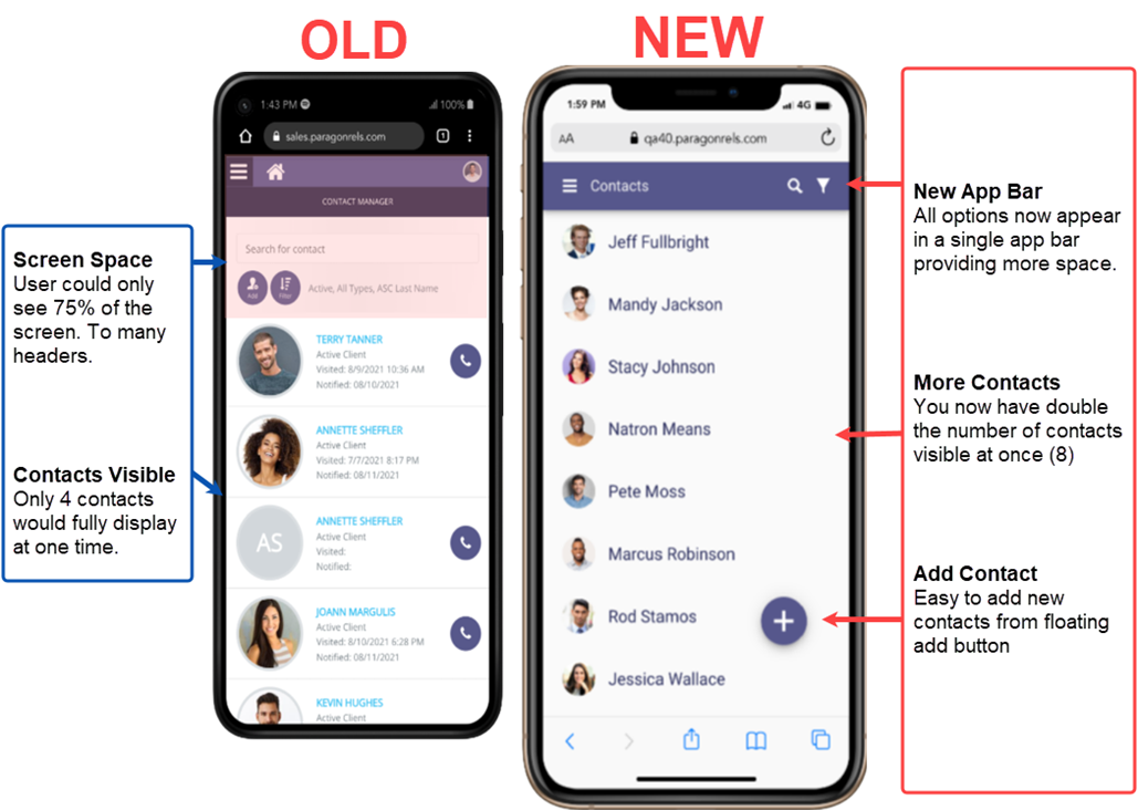
One of the most noticeable changes is to the Contact list’s overall layout. The previous version used up about 25% of the mobile screen with headers, search bars, action buttons, etc. As you can see now, the new version places the actions in the new top app bar, freeing up space to display twice as many Contacts as before.
Search
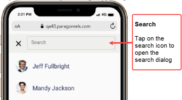
To search for a contact, tap on the search icon in the app bar. The top app bar will turn into a search bar, and as you begin typing, the application will automatically start searching the list for your contacts.
Filter Contacts
We’ve updated the filter function to enable you to find contacts more quickly. Instead of moving to a new screen, filter options will appear below the contact list (see below).
Add Contacts
We’ve also streamlined the process for adding a contact in Paragon Connect. On the contact list, you will find a floating button with a plus sign. We will use the floating plus sign as our new standard for adding new content within Paragon Connect. Tap on this button to launch the “Add Contact” form. We aim to continually add the ability to enter and edit more contact data in upcoming enhancements.
More Fields
By default, the add form displays the first and last name. Tapping the MORE FIELDS link will expand the form to show “Prefix” and “Suffix”.
Deleting Contacts
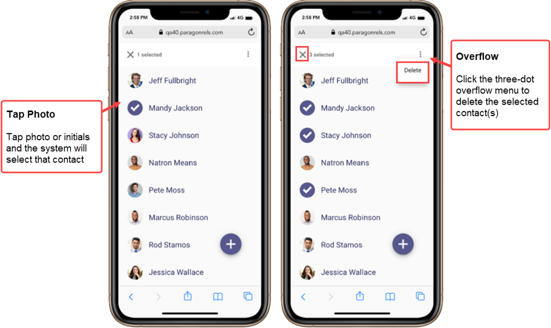
We’re adding the ability to delete one or more contacts from Paragon Connect. From the contact list, tap on the photo to select the contact. You can select multiple contacts by tapping the contact’s image. Once you have selected a contact, the top app bar changes to show the actions you can perform. You can tap the X to cancel your selection, or you can tap on the three-dot overflow menu and choose Delete to remove the contacts.
Selecting Multiple
You can also select more than one contact from the list. As of now, the only action you can take for multiple contacts is to delete them, but in the future we aim to add more options for multiple contacts.
Contact Viewer
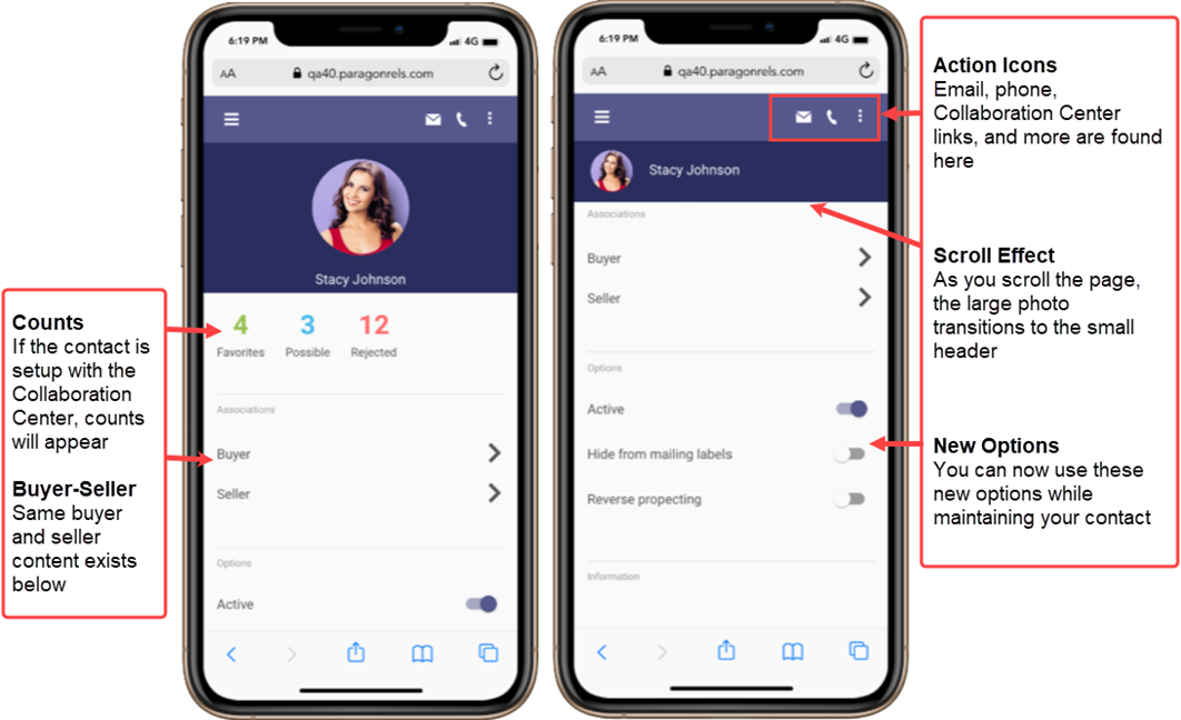
The contact viewer is the page that displays after you tap on a contact. We have updated and enhanced this page. The buyer and seller content are still available; however, we’ve moved the location of this information to make room for several future contact features
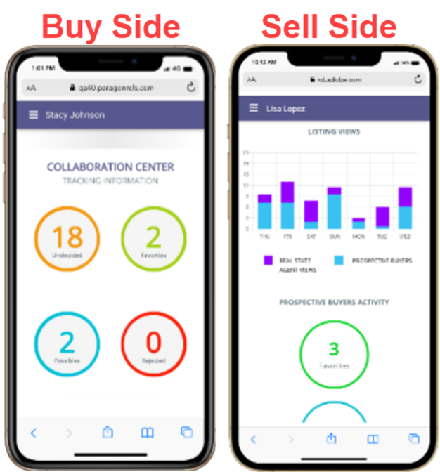
Buy Side
Tapping the Buyer link in the contact view will continue taking you to the Collaboration Center categories. Each of these is linkable to view the listings in each category. We’re planning future enhancements for this screen to manage your sites, communications, searches, and more.
Sell Side
The seller content also remains the same, even in new contact view, with the familiar statistical data, hits, counts, and more. We anticipate additional updates for this module, including managing your sell side options, competition information, and more.
Compose Email Updates
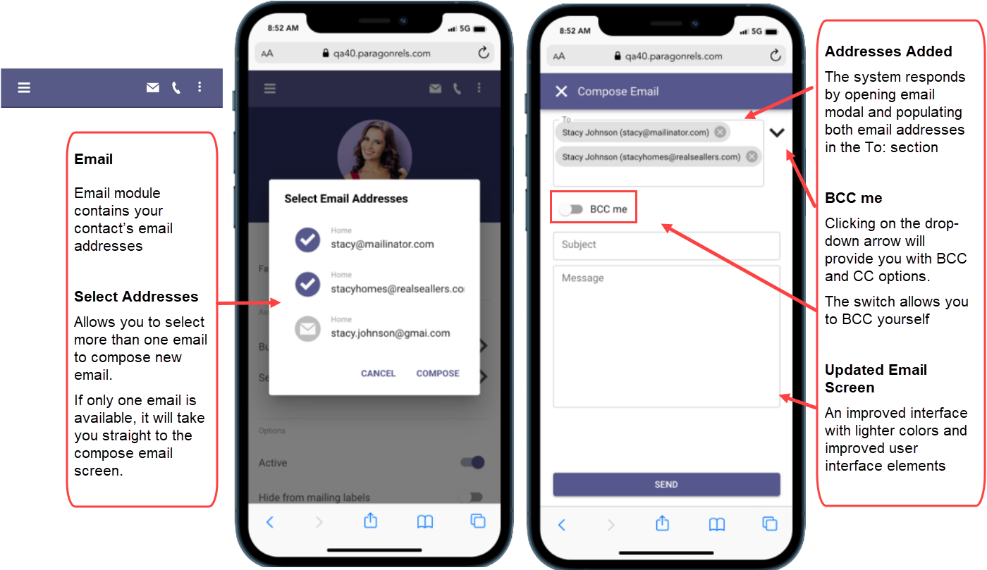
We’ve improved the process for selecting and composing emails in Paragon Connect. The new contact viewer allows you to choose one or more email addresses at a time before you compose the message – especially helpful for contacts with more than one email address. You will also find that the email module has a new layout designed to make composing an email easier and more standardized.
Auto Complete Address Book
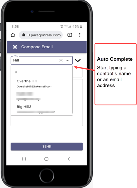
We’ve added the auto-complete address book feature to Paragon Connect. As you begin to type an email address or a contact, the system will return a list of possible matches based on the email addresses in your Paragon Connect address book. From this list, you can quickly find your recipient and move to composing an email.
For now, this new email module is only in the contact viewer, but we will eventually add it to other areas of Paragon Connect.
Phone Updates
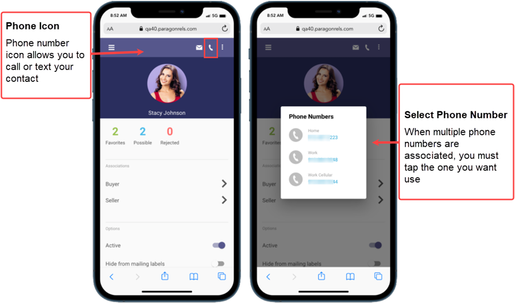
We have updated the phone and call interactions. Paragon Connect will now offer the option to choose between a contact’s multiple phone numbers – instead of defaulting to a primary. If you access Paragon Connect on a mobile phone, choosing a contact’s phone number will cause the app to prompt you to either make a call or send a text.
Texting
While using a mobile device, tapping on a contact’s phone icon will not only display all available phone numbers, but also provide you with an SMS option. Tapping the SMS icon will launch your phone’s default texting app. This allows you to instantly text your contacts without having to switch to a different app.
Note: We are unable to determine which phone numbers are mobile only, so all phone numbers will have this option on display next to it.
Show Password
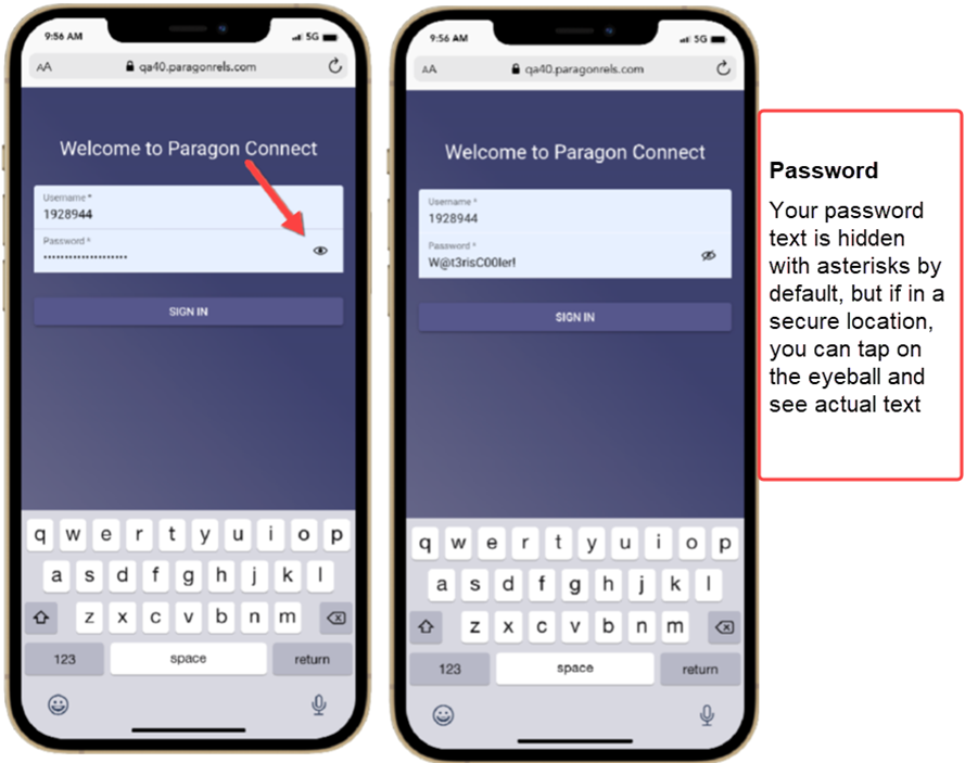
Remembering passwords and ensuring that you’ve typed them in correctly can be difficult, especially if you can’t see them. To help make the login process a bit easier, Black Knight has enabled a “show password” option. While you are in a secure location, you can tap on the eyeball icon to see the text you are typing in the password field.
Removed Items
As we transition over to these new features, you may notice some items missing in this latest release. Below is a summary of the items removed from Paragon Connect:
Theme Colors
We are removing theme colors from the Paragon Connect system. The new app bar and elements are not ready for additional theme colors, though in the future, we would like to reimplement these options.
Edit Profile Image
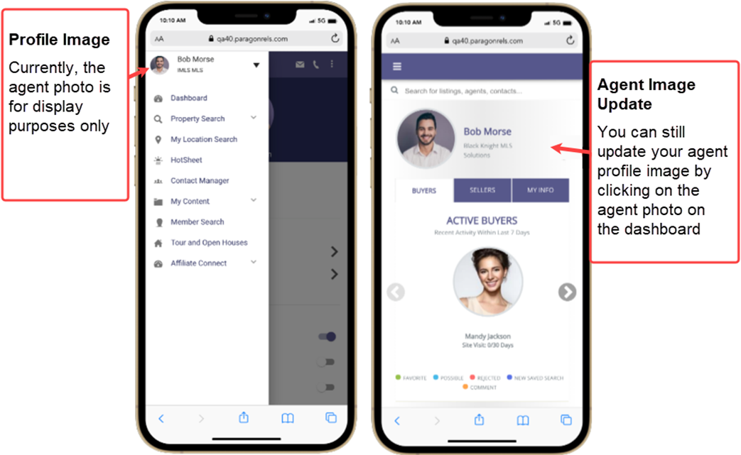
We’ve moved the profile menu from the top app bar into the left navigation.
Previously, tapping on your profile image in Paragon Connect allowed you to upload or snap a new profile image. While you won’t be able to do this from the profile picture in the top app bar, you can still upload or take a new photo by clicking on the agent profile image on the dashboard. We intend to add this feature back in a future release.
Updated Dec 2021

